Supporting a tweet with an image can have multiple benefits. It can complete the picture, add context, or simply act as a way to help the tweet stand out from the crowd. In this article I explore why I think most of us aren’t using images in Twitter properly and why I think any person or marketer looking to boost engagement, can do so simply by using a couple of basic principles.
How it all started
When Twitter introduced inline images back in 2013, it represented a sea-change in the way users would consume and crucially, engage with content presented to them in their timeline.
Previously, linked images would simply appear as a link in the tweet itself. Requiring a click to view the image in question. Showing images inline meant that users would now see the image in their timeline directly underneath the tweet.
It fascinates me that by simply removing a single click (which let’s be honest, is all that this approach really achieved on the technical level), could trigger such a change in how tweets are both composed as well as consumed. But none the less, it was Twitter’s adoption of the approach that heralded a more effective way for people to both present and personalise their tweets.
Hidden in this seemingly minor change to the way photos are handled in Twitter, lies a marketer's dream. But one I believe is not yet fully understood, or utilised.
So who is using inline images to powerful effect? And what can we learn from them?
As with anything, there are exceptions. I’ve seen a number of clever and engaging images linked to tweets that catch my eye and help deliver value to the wider proposition being offered, sold or reinforced by the person sending the tweet. Let’s take a look at a couple of them now.
Baremetrics
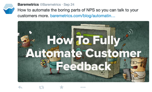
Josh Pigford at Baremetrics, is someone that I have been following for a while now. Not only have I noticed him take great care in the way he phrases his quotes (always aiming to add personality and a human touch) but this philosophy seems to also extend to the images he uses to support his tweets. Josh tends to switch between two image styles. The first style is effectively an illustration (perhaps purchased from a royalty free stock site like iStock - but i can’t be sure), such as the one below:
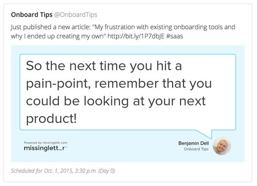
The other approach is a speech bubble style image, which includes a quote from the article or content that he is sharing.

I suspect that the speech bubble image is re-created manually each time he wants to use it. But none the less, the end-effect is one of consistency and personality. They always catch my eye!
Netflix
This example really doesn't need much explanation. As they say, a picture paints a thousand words. Let’s first see one of their tweets without a supporting photo:
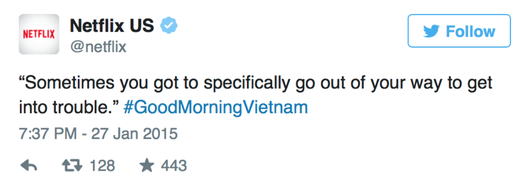
Sure, if you’re a fan of Good Morning Vietnam you’d get the reference and it may conjure up emotions and feelings that compel you to go and watch it. But with the image included, wow!
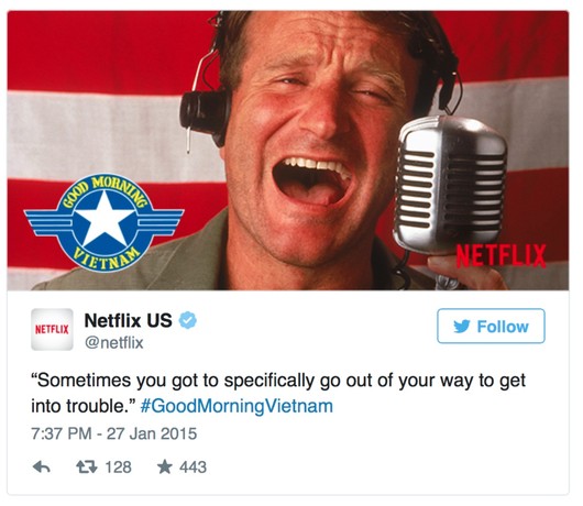
Now this might all sound incredibly basic… and it is! Including a photo with your tweets is no new, or difficult thing. As we all know though, turning these basic principles into a habit that ensures consistency across your marketing channels is the real challenge at hand.
What we can all learn and do right now to boost Twitter engagement
The general rule of thumb, I believe, is to employ a strategy of 'consistent variation' By which I mean that we should consistently mix up how we engage with our Twitter audience. I don't think it’s good enough to simply take one of the case-study approaches above and systematically follow their strategy for each and every one of your tweets. Put simply, your followers would get bored and would ultimately disengage with your brand.
Instead, we should draw from the case-studies above, and mix them into our wider Twitter marketing strategy. Some tweets would include image style A, some style B, whilst some would contain no image at all.
With that said, we can all start doing the following to boost engagement right now:
- When tweeting about an article from your blog, include a Baremetrics style quote bubble, highlighting one of the take-away quotes from the article.
- Include your brand or company logo on any image you include with a tweet. This will ensure that even if the photo is detached from the tweet and shared, your brand will persist.
- Make sure that any image you include (such as a supporting photo or illustration) is relevant to both the topic of your tweet as well as your audience. This might sound obvious, but you’d be surprised how many people simply attach a photo for the sake of it, without considering whether it’s suitable.
- Don’t include a photo at all (but just some of the time - see my note above on ‘consistent variation’).
And now for the downside: Doing all, or even part of the above, can be time consuming and quite frankly, when it comes to social media marketing, it’s all about consistency (both in terms of a general marketing strategy, as well as timing / tweet scheduling).
Whenever a manual process is required, such as tailoring images, it’s very easy to forget to do it. Turning it into a habit can be near on impossible.
Using missinglettr to help you stick to a consistent marketing strategy
The analysis above, and its underlying principles and problems, is one that I have been pondering for quite a while now. Employing a social marketing strategy that makes proper use of images, always felt too disjointed and time intensive. I simply couldn't find the discipline to consistently stick to a plan.
This ‘pain’ ultimately lead us to build missinglettr, which for those that have only just discovered us helps our users create unique social marketing campaigns for their new blog posts. Campaigns are spread out over a year, helping them feel natural and non-spammy.
One task we’ve been challenging ourselves with this week is how to offer imaging options like the ones described above, but in an automatic way... without the need for any intervention from our users. What we’ve ended up with, is an extension to our platform that automatically creates images like the one below, based on your own content. In addition to these automatically generated images, we also extract any images embedded in your blog posts, so that a nice mixture of image styles can be interwoven into your wider social marketing strategy.
We’re super excited about this new feature, but that aside, I’d love to hear how you are using images within your tweets. I’ll perhaps write a follow-up article with examples and links to the best (and worst) ones shared with me :)

